A
Orders
Separate active preparation from order history and order details.

CASE STUDY · MARKETPLACE · MERCHANT EXPERIENCE
A closer look at the SafeBoda merchant experience: the operational problems that surfaced in research, the priorities we identified, and the interface directions explored to make everyday work clearer.
THE CONTEXT
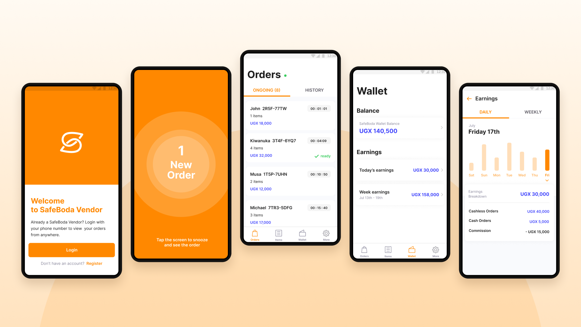
For merchants using SafeBoda, the app was part of the day-to-day work of running a business on the platform. They needed to keep track of orders, understand transactions and earnings, and manage the details that keep their storefront operating.
The opportunity was to make those tasks easier to understand and easier to reach, especially when merchants were moving quickly between serving customers and managing the platform.
WHAT WE HEARD & OBSERVED
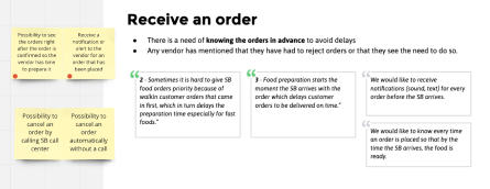
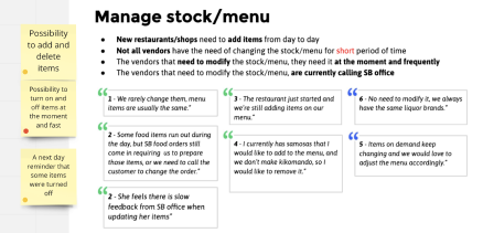
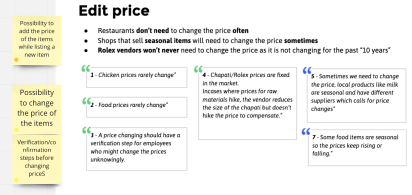
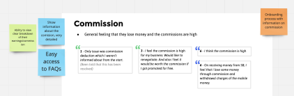
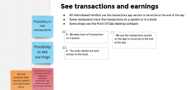
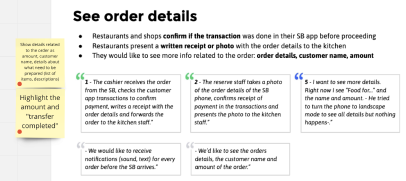
The research material grouped feedback around the tasks merchants needed to complete. These six themes show where the existing experience created uncertainty or extra effort.
FROM RESEARCH TO PRIORITIES
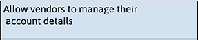
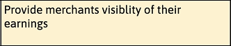
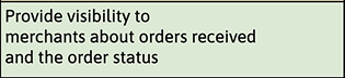
The synthesis translated individual issues into broader needs: merchants wanted control over their account, visibility into their earnings and orders, and a way to manage the operational details of their business.




RESEARCH SYNTHESIS
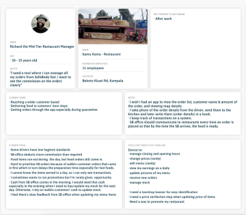
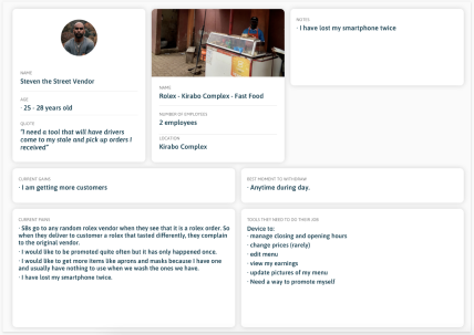
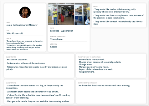
We used these three merchant personas to make different business contexts visible — from restaurant management and street vending to running a supermarket. Their needs helped us look beyond individual screens and consider the wider merchant experience.
THE DESIGN QUESTION
Rather than treating each screen as a separate destination, the design challenge was to create a structure that reflected the main jobs merchants needed to complete.
That meant making the relationship between orders, transaction history, earnings, settings and item management easier to understand. It also meant giving frequently used tasks a predictable place in the experience.
INFORMATION ARCHITECTURE
The navigation map groups the experience around four main areas: Orders, Transactions, Settings and Items. Each area then opens into the tasks merchants need to complete.
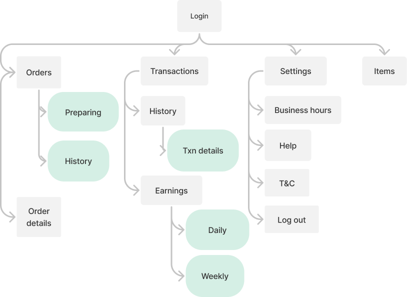
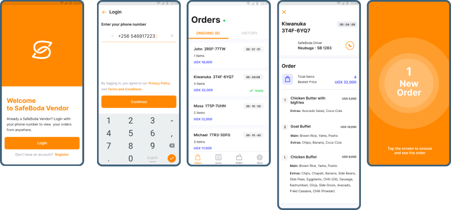
Separate active preparation from order history and order details.
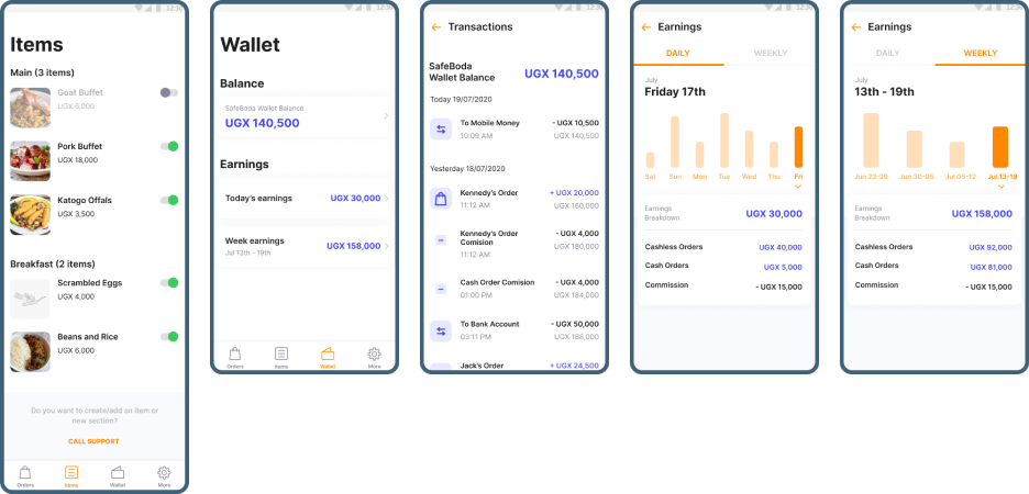
Bring transaction history, individual details and earnings into one place, with daily and weekly views.
Keep business hours, help, terms and conditions, sign-out and item management easy to find.
INTERFACE EXPLORATION
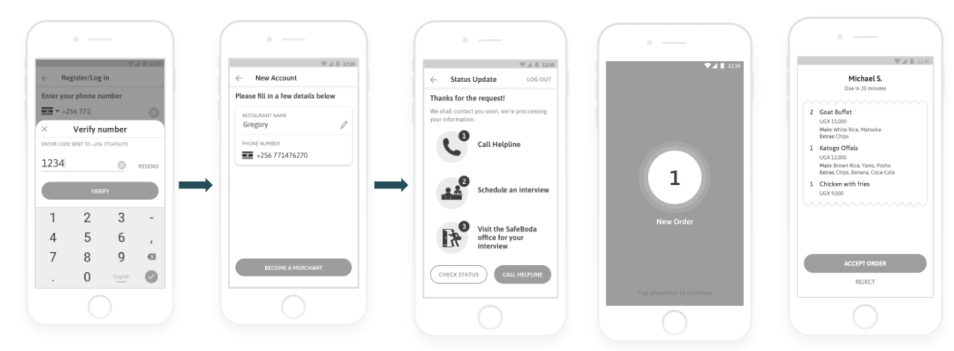
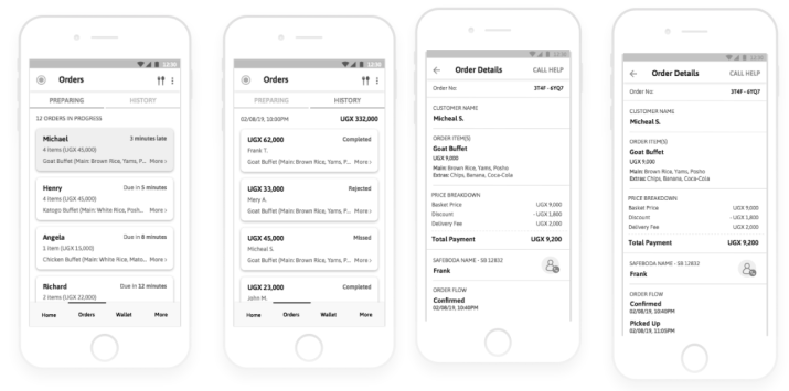
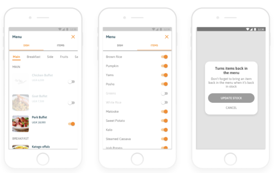
From task flows to more developed screen concepts, these explorations show how the priorities were translated into a merchant-facing interface.
MARKET CONTEXT
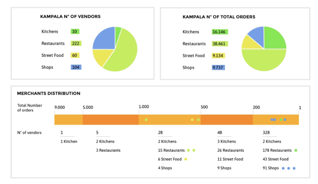
This Kampala snapshot compares vendor counts with order volumes across kitchens, restaurants, street food and shops. It helped frame the range of merchant types and operating scale the experience needed to support.
SAFE BODA MERCHANT DELIVERY OUTCOME
After the redesigned merchant experience was introduced, we saw the order-output rate rise from 14% to 23%. Food orders could also move through fulfilment more quickly, helping merchants manage orders more efficiently.
Previous app: 14% · Redesigned merchant experience: 23%.
Food orders could be delivered much quicker after the new merchant experience was introduced.
We compared the order-output rate before and after the redesign. The change is 9 percentage points, not a 23% relative increase.
DESIGN TAKEAWAY
The work brought together two connected needs: a clearer information structure and better visibility into the operational details merchants rely on. Orders should be easy to manage, transactions should be understandable, and supporting business settings should be predictable to find.
For a merchant, clarity isn't a cosmetic improvement. It helps keep the work moving.