More local choice
Customers wanted to discover local restaurants and street food, rather than feel limited to a narrow selection.

CASE STUDY · FOOD DELIVERY · CUSTOMER EXPERIENCE
Exploring how SafeBoda could make food discovery and ordering feel more relevant to local customers — with more choice, more personalisation and a better sense of what happens after an order is placed.
THE OPPORTUNITY
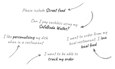
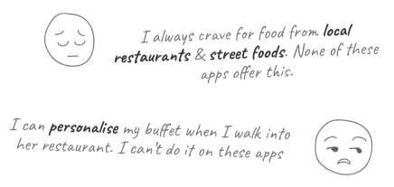
Customers were looking for more than a catalogue of restaurants. They wanted access to local restaurants and street food, the ability to personalise a dish, and a way to order from places they already knew and liked.
The opportunity was to explore a food experience that felt closer to the customer's real choices — not just what happened to be easiest to list in an app.
CUSTOMER NEEDS
The feedback captured in the project material highlights a desire for more local choice, greater control over food and clearer order progress.
Customers wanted to discover local restaurants and street food, rather than feel limited to a narrow selection.
They wanted to personalise dishes — for example, adjusting a meal to their own preferences.
They wanted to track an order and understand what was happening between placing it and receiving it.
EXPLORING THE EXPERIENCE
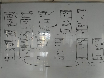
We explored how customers might move from opening the food experience to finding a restaurant, choosing a meal, customising it and following the order. The early sketches helped make the flow tangible before committing to detailed screens.
EARLY IDEATION
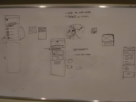
The whiteboard sketches capture early thinking around restaurant discovery, categories, food selection and how key information could fit into the mobile experience.
FLOW EXPLORATION
The wireframes show a broader sequence of screens and interactions, from browsing and selecting food through to the supporting steps in the ordering experience.
FINAL DESIGNS
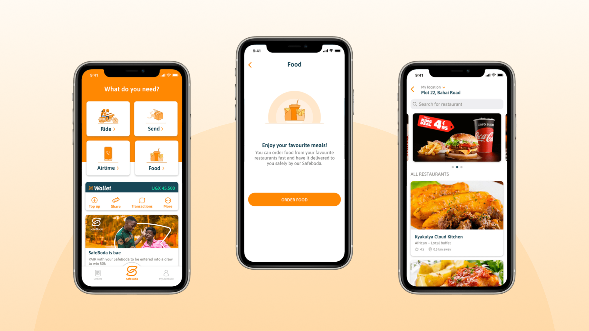
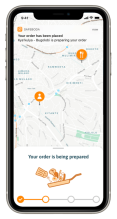
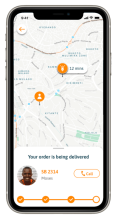
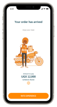
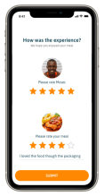
After working through customer needs, early concepts and the end-to-end journey, we arrived at this final set of screens. They show the experience we chose to take forward, from food discovery through to order completion.
Entering the food experience and exploring available restaurants and meals.
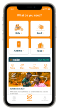
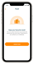
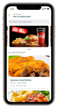
Browsing restaurant menus, narrowing choices, selecting food and reviewing the order.
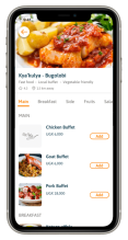
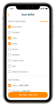
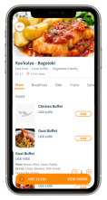
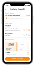
Keeping customers informed while the order is prepared, delivered and completed.
OUTCOMES
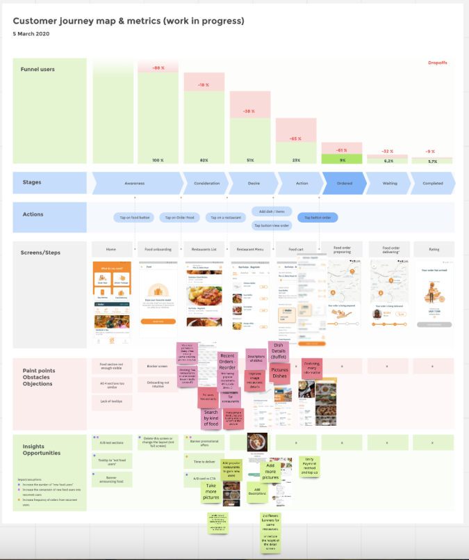
We used the journey map to understand where customers encountered pain points and where they dropped off. Because customers often opened the app hungry and looking to make a quick decision, we saw that the extra screen between the homepage and the food section added friction without helping them choose. We removed that step so customers could reach food more directly.
The map also helped us identify opportunities to test. For example, we considered trying a different call-to-action on the order confirmation screen to see whether it could improve the relevant conversion metrics.
DESIGN TAKEAWAY
The research and design work pointed towards a food experience that supports local discovery, gives customers meaningful control over their meals and keeps them informed after they order.
The goal was to make the choices feel more like the ones people wanted to make.